Bachstelze
Personal Blog about anything - mostly programming, cooking and random thoughts
Die Halterung für den Treppenschutz passt nicht auf unser Geländer. Daher hab ich dieses einfache Teil als Ersatzlösung gedruckt.
Die zwei Einzelteile werden mit zwei M6 Schrauben und Muttern verbunden. Für einen guten Andruck ist in die eine Hälfte ein Filzstreifen eingeklebt.
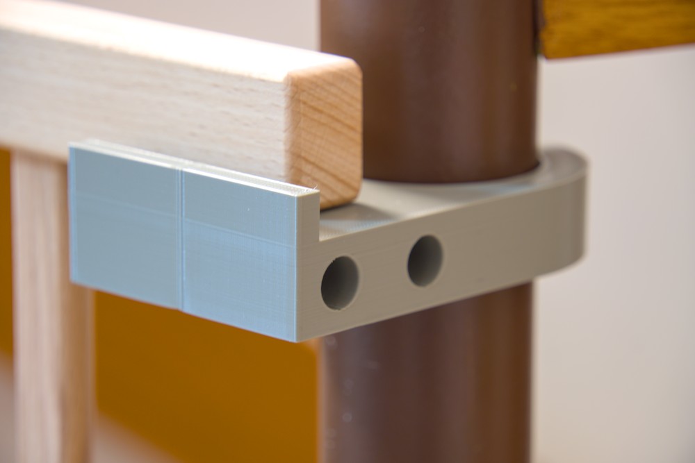
#3dprint #3ddruck #kind


My current hobby project turned from procedural geometry generation to game development. The current idea is to use the procedural generations I've created so far to build a library where the player can interact with the books. For this I need an animated book model which can be opened and closed.
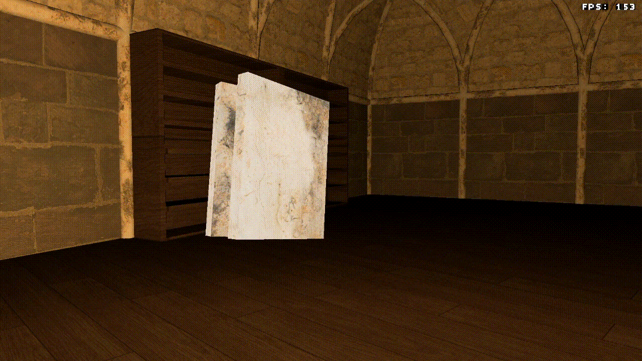
I've created a simple model and animation and blender and exported these in the GLTF format. In my "game engine" I've implemented a GLTF parser from scratch and added an animation system to the rendering. I'll assume your are familiar with the basic concept of joint/bone based animation and linear algebra for gamedev.
In my implementation, I've only cared about the binary file format .glb of the GLTF standard.
In this format, meta and binary data are stored in the same file, which I find more convenient for my use case.
Alternatively the data can also be split into the meta data .gltf file and (multiple) binary files .bin.
The meta data in GLTF is stored in a JSON format. The format specifies different object types which are hierarchically organized in scenes as nodes. References between objects are generally given as indexes into the corresponding object array within the JSON data.
Most objects will eventually reference to accessor objects. These describe in which format and where in the binary data values are stored.
I won't go into too much detail about loading meshes from GLTF, as this isn't the focus of this article.
Meshes have a list of primitives which define the geometry.
Each primitive has a set of attributes, which are accessor indexes for different attributes of vertices, e.g. position and normal data.
Additionally, the primitive object has an indices attribute which points to another accessor.
The indices data indexes into the arrays of the attributes, defining the triangle structure.
For animated meshes it's important to load the JOINTS_0 and WEIGHTS_0 attributes.
The joints data has to be stored as a 4D integer vector and the weights as 4D floating point vector.
The data will be used at the very end in the vertex shader to apply the joint transformations to the vertices.
Important to note here is that a mesh might have additional JOINTS_n and WEIGHTS_n attributes. This will occur when a single vertex is influenced by more than 4 joints.
For animations two object types are important; skins and animations.
Skins define the skeleton used in our animation.
The two attributes we're interested in are joints and inverseBindMatrices.
The joints array holds indexes referring to node objects.
These are the bones of the skeleton.
The hierarchy has to be read from the nodes, which have children attributes.
The inverseBindMatrices attribute is an index to an accessor.
This accessor locates an array of 4x4 matrices in the binary data.
The array must have at least as many matrices as there are joints in the skin object.
These matrices will be needed later to apply the animation to our model
Animations define the transformations which are applied to the skin.
They have two arrays of child objects which define the transformations; channels and samplers.
The channels map attributes of joints to samplers.
The example below says, that the sampler 0 describes the translation part of the animation for joint 2. Each joint can have a channel for each different transforms: translation, rotation and scale. (There is also "weights" but I've ignored this as it only applies to morph targets)
{
    "sampler":0,
    "target":{
        "node":2,
        "path":"translation"
    }
},
The samplers have three attributes; input, interpolation and output.
Input and output are again indexes to accessors, which point to arrays of equal length.
The input values are time stamps in the animation, while the output are the values at the corresponding time stamp.
The type of the output differs based on the transformation, while the input is always a scalar.
The interpolation defines how values between sample points should be interpolated.
In my implementation I've first transformed the data read from the sample into these structs.
An AnimationPoint holds the corresponding input and output values.
An AnimationSequence is a vector for points + the interpolation method.
An AnimationSet gathers all sequences for the different transformations of a single joint.
pub struct AnimationPoint<T> {
    pub input: f32,
    pub output: T,
}

pub struct AnimationSequence<T> {
    pub points: Vec<AnimationPoint<T>>,
    pub interpolation: GltfSamplerInterpolation,
}

pub struct AnimationSet {
    pub translation: AnimationSequence<Vec3>,
    pub rotation: AnimationSequence<Vec4>,
    pub scale: AnimationSequence<Vec3>,
    pub weights: AnimationSequence<f32>,
}
A Joint holds it's own animation data, the inverse bind matrix and the indexes of its children.
The child association is important later on to calculate the transformation matrices.
The child indexes here are not the values read from the JSON data but the position of the joint in the animation struct.
The Animation just holds a vector of joints and stores the index of the root joint.
The common root of the skeleton has to be determined by the implementation itself and is not stored in the GLTF data.
However the standard states that the joints of a skin must have a common root.
pub struct Joint {
    set: AnimationSet,
    inverse_bind_mat: Mat4,
    children: Vec<usize>,
}

pub struct Animation {
    joints: Vec<Joint>,
    common_root: usize,
}
Now that we have gathered all data required, we can finally do the animation itself. For this we need to calculate a transformation matrix for each joint.
This part took me the longest time. I still had a vague idea what had to happen from university (10+ years ago) but it still took me multiple sessions to find all errors and missing calculations in my implementation. Lisyarus blog post was a great resource as well as the Vulkan example by Sascha Willems.
I'm still not very familiar with the terminology but hopefully this explanation will help :). Each joint has a local matrix which is defined by its translation, rotation and scale at given point in time. These values have to be read and interpolated from the animation sequence. The values are then transformed into 4x4 matrix and multiplied in this exact order to retrieve the local matrix.
Joint(N, t) = Translation(N, t) * Rotation(N, t) * Scale(N, t)
Next we have to include the hierarchy into our transformations. Each local matrix only describes how a vertex is transformed in the reference frame of the joint. But joints themselves are also move be their parents (when the arm moves the hand is also moved). These transformations also need to be applied to our vertices. Therefore we need to traverse the hierarchy and apply each local matrix of a parent to its children. This has to happen recursively, such that each joint "includes" all transformation from the root to itself.
This can be achieved by traversing the tree starting at the common root. For each child we simply multiply the local matrix with the matrix of the parent in the correct order. By starting at the root we guarantee that the matrix of the parent joint already includes all previous matrices.
Joint(N, t) = Parent(N, t) * Joint(N, t)
let mut queue = VecDeque::new();
queue.push_back(self.common_root);
while let Some(parent) = queue.pop_front() {
    for child in self.joints[parent].children.iter() {
        joint_mats[*child] = joint_mats[parent] * joint_mats[*child];
        queue.push_back(*child);
    }
}
Finally we have to include the inverse bind matrix, again at the correct place. I still don't understand 100% how this matrix functions, but it brings the vertex into the correct reference frame before the joint transformations are applied.
Joint(N, t) = Joint(N, t) * InverseBindMatrix(N)
After this step we have a set of matrices which can be sent of to the GPU to be used in our vertex shader.
Now that the hard part is done, we just have to apply the animation to each vertex in the vertex shader. I've passed the calculated joint matrices via a read-only storage buffer (I'm using wgpu for rendering).
Each vertex has a vec4<u32> of joints indexes and corresponding weights as vec4<f32>.
To arrive at the final matrix for a joint look up the correct joint matrices and calculated the weighted sum.
    var ani_matrix = model.weights[0] * joint_positions[model.joints[0]] +
            model.weights[1] * joint_positions[model.joints[1]] +
            model.weights[2] * joint_positions[model.joints[2]] +
            model.weights[3] * joint_positions[model.joints[3]];

    out.world_pos = model_matrix * ani_matrix * vec4<f32>(model.position, 1.0);
If you did everything correctly you should now be able to enjoy your glorious animations. Otherwise the model will be a distorted mess and you are sent onto an adventure to look for subtle bugs in any of these steps. Here are some of the errors I had to fix before my animations looked right:
#gamedev #animation #rust #gltf #3d
Ein Halter für Karteikarten (Größe A6).
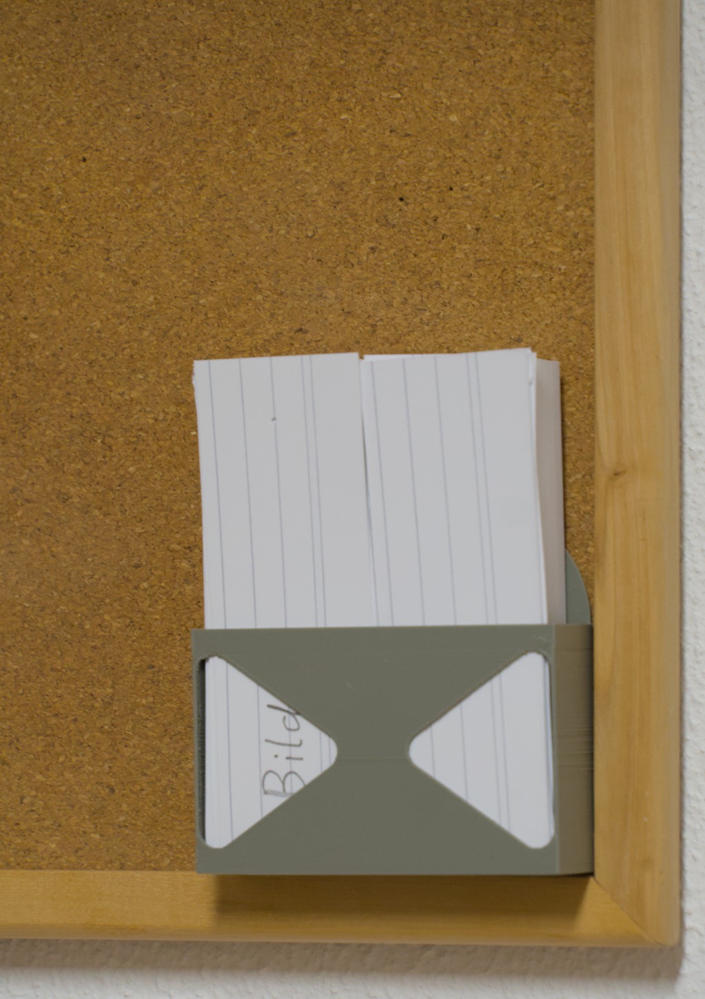
#3dprinting

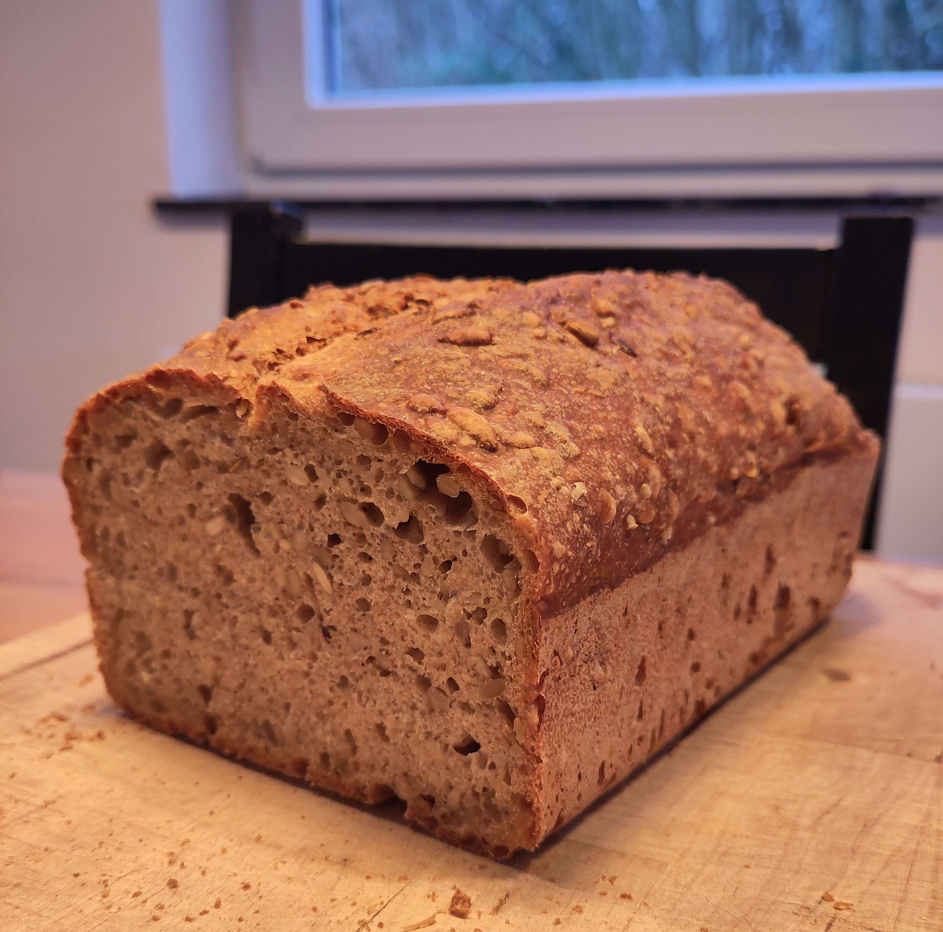
Ein einfaches Kastenbrot mit Sonnenblumenkernen. Das Rezept ist sehr flexibel. Gehzeiten können verlängert werden, wenn der Teig im Kühlschrank geht. Wenn es schnell gehen muss kann auch mehr Hefe benutzt werden. Ebenso können die Sonnenblumenkerne durch andere Saaten ausgetauscht werden.
Einfacher Halter für das Batteriepack an einer Lichterkette. Kann ohne Support gedruckt werden.

Dateien: