Visualizing Data on Maps using matplotlib and geopandas
# Published: by h4korFor visualizing the heating and cooling degree days of Germany I had to learn how to plot maps.
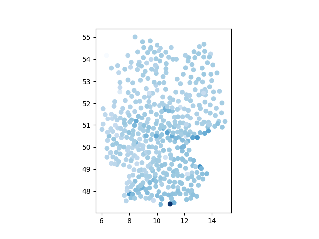
First Look
My data source was a bunch of CSV files, which I combined into a single DataFrame, including latitude and longitude columns. I've used geopandas to plot this data for a first visualization. The DataFrame can be turned into a GeoDataFrame to create geometry information from the longitude and latitude columns. It's important to specify the right coordinate reference system (CRS) of your data.
With this conversion the data can be plotted using the plot function of geopandas
df = load_my_dataframe(...)
gdf = gpd.GeoDataFrame(
    df, geometry=gpd.points_from_xy(df["Longitude"], df["Latitude"]), crs="EPSG:4326"
)
ax = gdf.plot(
    column="ValueToVisualize",
)
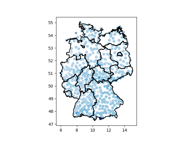
Adding Boundaries
The shape of Germany is already recognizable, but some more context would be beneficial. For this reason I've added the borders of the German states to the plot. The shape files of all European countries can be downloaded from eurostat in various formats. I've used the "Polygon (RG)" version and the .shp format. The files contain the borders on different levels (country, state and regional borders). With a few lines the borders can be added to the plot.
border_file = "NUTS_RG_01M_2021_3035.shp/NUTS_RG_01M_2021_3035.shp"
eu_gdf = gpd.read_file(border_file)
eu_gdf.crs = "EPSG:3035"
gdf_de = eu_gdf[(eu_gdf.CNTR_CODE == "DE") & (eu_gdf.LEVL_CODE == 1)]
gdf_de.to_crs("EPSG:4326").boundary.plot(ax=ax, color="black")
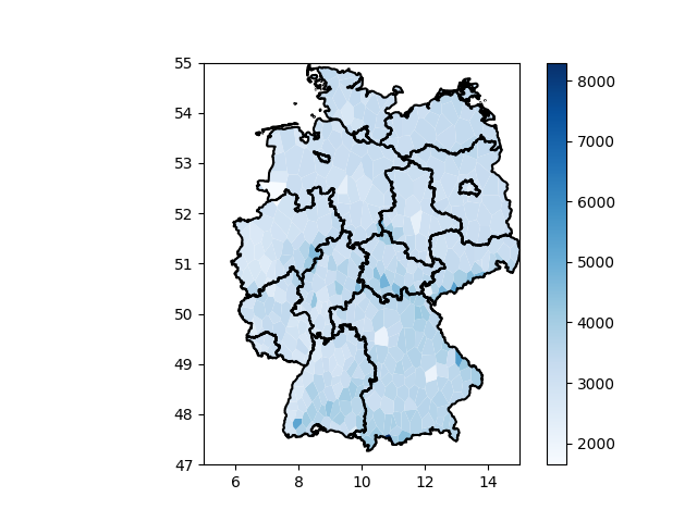
Filling the Map
Using points to visualize this data is not the best approach. Instead I want to fill the entire map where each pixel is colored according to the nearest data point. This can be achieved by computing a Voronoi Diagram, where each data point is turned into a face. I've tried to use the geoplot library to compute the voronoi diagram, but it got stuck on my data. Luckily scipy also has a voronoi implementation, but it's a bit more work to use.
# create a box around all data
min_lat = df["Latitude"].min() - 1
max_lat = df["Latitude"].max() + 1
min_lon = df["Longitude"].min() - 1
max_lon = df["Longitude"].max() + 1
boundarycoords = np.array(
    [
        [min_lat, min_lon],
        [min_lat, max_lon],
        [max_lat, min_lon],
        [max_lat, max_lon],
    ]
)
# convert our data point coordinates to a numpy array
coords = df[["Latitude", "Longitude"]].to_numpy()
all_coords = np.concatenate((coords, boundarycoords))
# compute voronoi
vor = scipy.spatial.Voronoi(points=all_coords)
# construct geometry from voronoi
polygons = [
    shapely.geometry.Polygon(vor.vertices[vor.regions[line]])
    for line in vor.point_region
    if -1 not in vor.regions[line]
]
voronois = gpd.GeoDataFrame(geometry=gpd.GeoSeries(polygons), crs="EPSG:4326")
# create dataframe
gdf = gpd.GeoDataFrame(
    df.reset_index(),
    geometry=voronois.geometry,
    crs="EPSG:4326",
)

# plot borders
gdf_de.to_crs("EPSG:4326").boundary.plot(ax=ax, color="black")
# clip geometry to inside of map
clip = eu_gdf[(eu_gdf.CNTR_CODE == "DE") & (eu_gdf.LEVL_CODE == 0)]
gdf = gdf.clip(clip.to_crs("EPSG:4326"))
# plot data
gdf.plot(
    ax=ax,
    column="Monatsgradtage",
    cmap="Blues",
    legend=True,
)
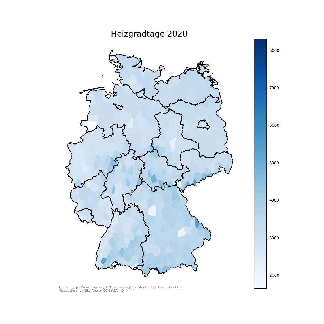
Making it beautiful
The plot is almost done, I only want to clean it up a bit. As the axis don't serve any purpose here, I removed them. Additionally I've added a title and a small text to the bottom to include the source in the graphic.
ax.set_title(f"Heizgradtage 2020", fontsize=20)
ax.axis("off")
ax.text(
    0.01,
    0.01,
    "Quelle: https://www.dwd.de/DE/leistungen/gtz_kostenfrei/gtz_kostenfrei.html\nVisualisierung: Niko Abeler CC-BY-SA 4.0",
    ha="left",
    va="top",
    transform=ax.transAxes,
    alpha=0.5,
    fontsize=8,
)