Visualizing Likert Scale Survey Data
I'm currently helping to evaluating a large market research survey, which ueses Likert Scales. To visualize the data I've tried several plots. The plots below where created with artificially created data to expose the strengths and weaknesses of different plot types.
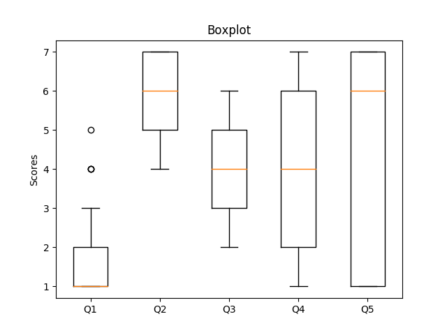
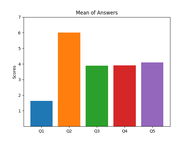
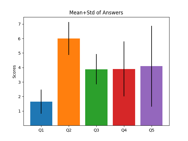
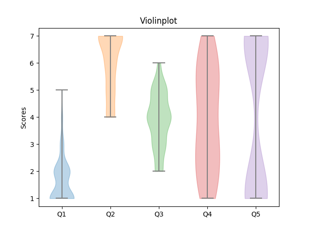
Data distribution:
You can find the code for all plots here!
Bar Plot: Mean Values
Pros:
- Easy to create
- Simple to read
- Q3 – Q5 distinguishable
Cons:
- Hides a lot complexity
- Doesn't show spread
- Creates high confidence in shown values
Bar Plot: Mean values and Standard Deviation
Extension of first plot.
Pros:
- Still simple
- Introduces skepticism into shown data
- Hints at spread in data
Cons:
- Hides a lot complexity
- Still doesn't show distribution
Violin Plot
Pros:
- High Resolution
- Shows distribution of data
Cons:
- Harder to read
- Noisy on small sample sizes
- Shows data as being continuous
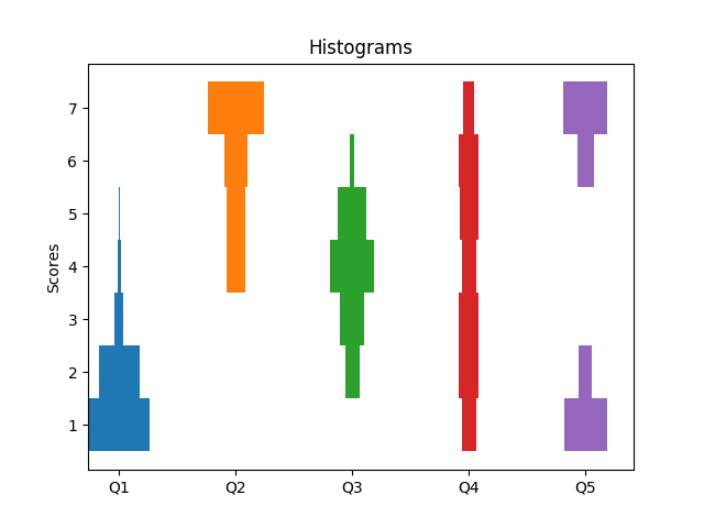
Vertical Histograms
Pros:
- High Resolution
- Shows distribution of data
Cons:
- Harder to read
- Shows data as being continuous
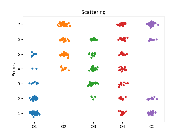
Scatter Plot
Pros:
- High Resolution
- Actually shows complete data
- Shows distribution of data
Cons:
- Hard to read
- Introduced noise and overdraw can distort data
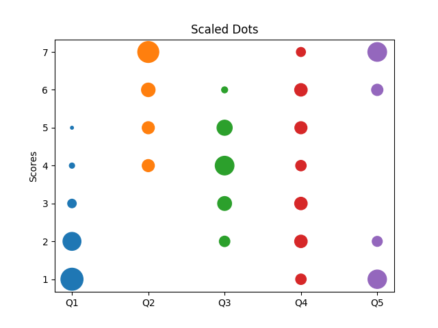
Scaled Dots
Pros:
- High Resolution
- Shows distribution of data
- Shows data as discrete values
Cons:
- Visual distortion of proportions
- Humans can't easily compare circle sizes
Scaled Dots
Pros:
- Looks scientific
- Contains Median, Quantiles
- Shows outliers
Cons:
- Not designed for discrete data
- Doesn't show distribution correctly (e.g. Q4 + Q5)