Den Haag


Personal Blog about anything - mostly programming, cooking and random thoughts
Zum 1. Juli 2020 wurde in Deutschland, als Teil des Corona-Konjunkturpakets, die Mehrwertsteuer von 19% auf 16%, bzw von 7% auf 5%, gesenkt. Schon bei der Ankündigung der Senkung wurde spekuliert ob diese tatsächlich an den Verbraucher weitergegeben wird, oder ob das Geld in den Konzernen stecken bleibt.
Um zu überprüfen wie mit der Senkung umgegangen wird habe ich kurz nach der Ankündigung angefangen Preisdaten zu sammeln. Hierfür habe ich die Webseiten von 10 deutschen Unternehmen stichprobenartig beobachtet. Dabei wurde täglich der Preis aller gelisteten Artikel gespeichert (max 25000 Artikel pro Unternehmen). Beobachtet habe ich die Unternehmen:
Ich hätte gerne noch mehr Unternehmen beobachtet, jedoch ließen sich viele Webseiten nicht reibungslos auswerten. Insgesamt habe ich 3.228.617 Preise von 368.452 Produkten erfasst (Stand: 03.07.20).
Als leichter Einstieg in die Auswertung dient die Preisentwicklung bei BMW. Die Preise bleiben konstant bis zum 2. Juli (da ich die Daten nachts erhoben habe kann es durchaus sein das die Preise schon am 1. Juli gesenkt wurden) und sinken dann um etwa 3% ab. Hier wurde die Mehrwertsteuersenkung direkt an den Kunden weitergegeben.
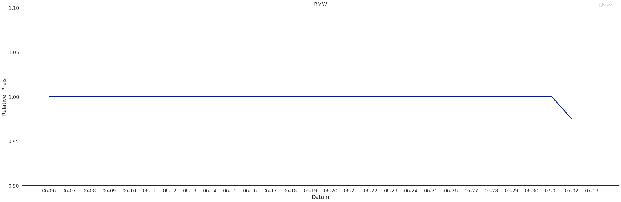
An diesem Graphen lässt sich die Visualisierung leicht erklären. Für jeden Artikel berechene ich täglich den "relativen Preis". Dafür gucke ich mir die Preise eines Artikels über den gesamten Beobachtungszeitraum an und nehme an das der "normale" Preis der am häufigsten vorkommende Preis ist. Dann werden alle Preise durch diesen normalen Preis geteilt um den relativen Preis zu bekommen. Auf diese weise lassen sich die Preise normieren, was Auswertung und Visualisierung deutlich vereinfachen.
Etwas spannender wird das ganze schon bei Aldi Nord.
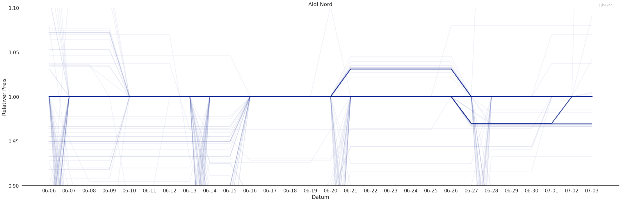
Hier kann man sehen das die Preise immer wieder abweichen. Die schwachen Linien ober und unterhalb der Hauptlinie zeigen Preisänderungen. Zu Beginn der Beobachtung sieht man Rabattaktionen in denen wenige Artikel günstiger sind als normalerweise. Das erste interessante Ereignis gibt es am 21.6. Hier werden viele Artikel ca. 3% teurer. Am 27.6 fallen all diese Artikel wieder auf ihr normales Niveau zurück und gleichzeitig werden andere Artikel ca. 3% billiger. Mit Beginn der der Mehrwertsteuersenkung werden die meisten Artikel wieder teurer und nur wenige bleiben um 3% reduziert.
Auf den ersten Blick sieht es so aus als würde Aldi Nord die Ersparnisse durch das Konjunkturpaket nicht an ihre Kunden weitergeben. Jedoch scheint sich Aldi Nord dafür entschieden zu haben nicht die Preise anzupassen, sonder einen Rabatt auf den Einkauf zu geben.
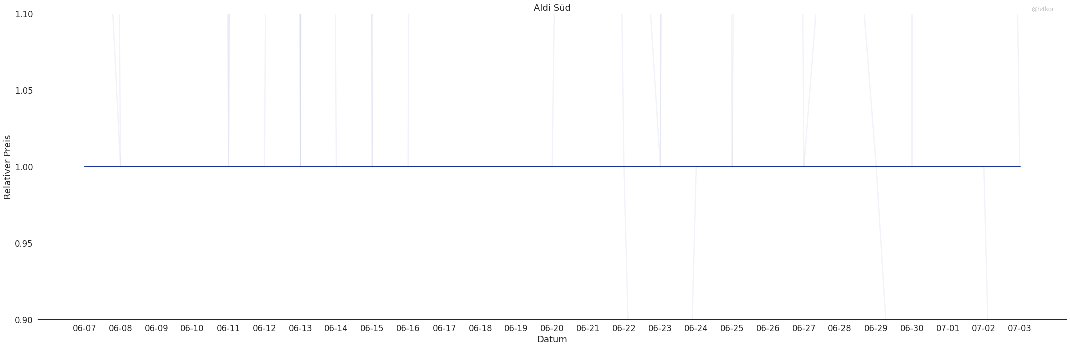
Ähnlich sieht es bei Aldi Süd aus. Hier gab es jedoch keine Preiserhöhung oder -senkung vor der Mehrwertsteuersenkung
Der Konkurrent Kaufland hat sich scheinbar entschieden die Preise selbst zu senken.
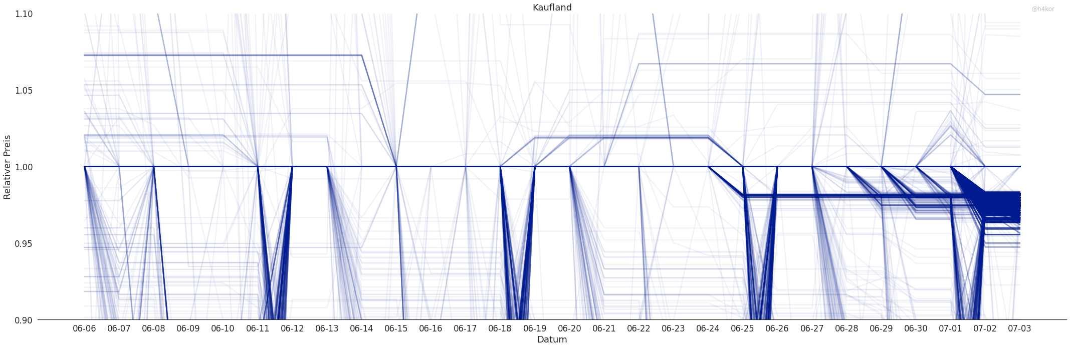
Wenige Artikel wurden zwei Wochen vor der Senkung teurer, aber ein ähnlicher (schwächerer) Effekt lässt sich am Anfang der Beobachtung erkennen. Eine Woche vor der Senkung hat Kaufland schrittweise angefangen die Preise anzupassen, jedoch sind nicht alle Preise gesenkt worden. Hier wäre eine detailliertere Analyse notwendig um zu sehen um welche und wieviel Artikel es sich handelt.
Deutlich chaotischer scheint es bei Netto zuzugehen.
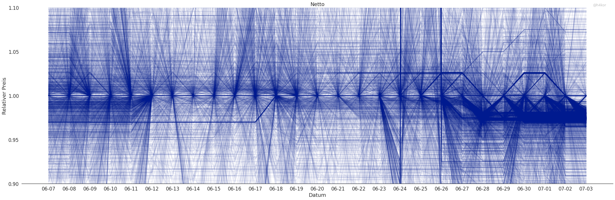
Hier gibt es ständige Preisänderungen und Rabattaktionen die viele Artikel betreffen. Auch hier sieht man, dass ab dem 27.6 die Preise an die neue Mehrwertsteuer angepasst wurden. Auffällig hier sind die angehobenen Preise am 18.6 und die zum 27.6 immer dicker werdende Linie bei etwa 3%. Hier sollte noch etwas genauer nachgeguckt werden. Es könnte sein, dass hier Preise vor der Senkungen angehoben wurden.
Der Preisgraph für MediaMarkt sieht ähnlich chaotisch aus.
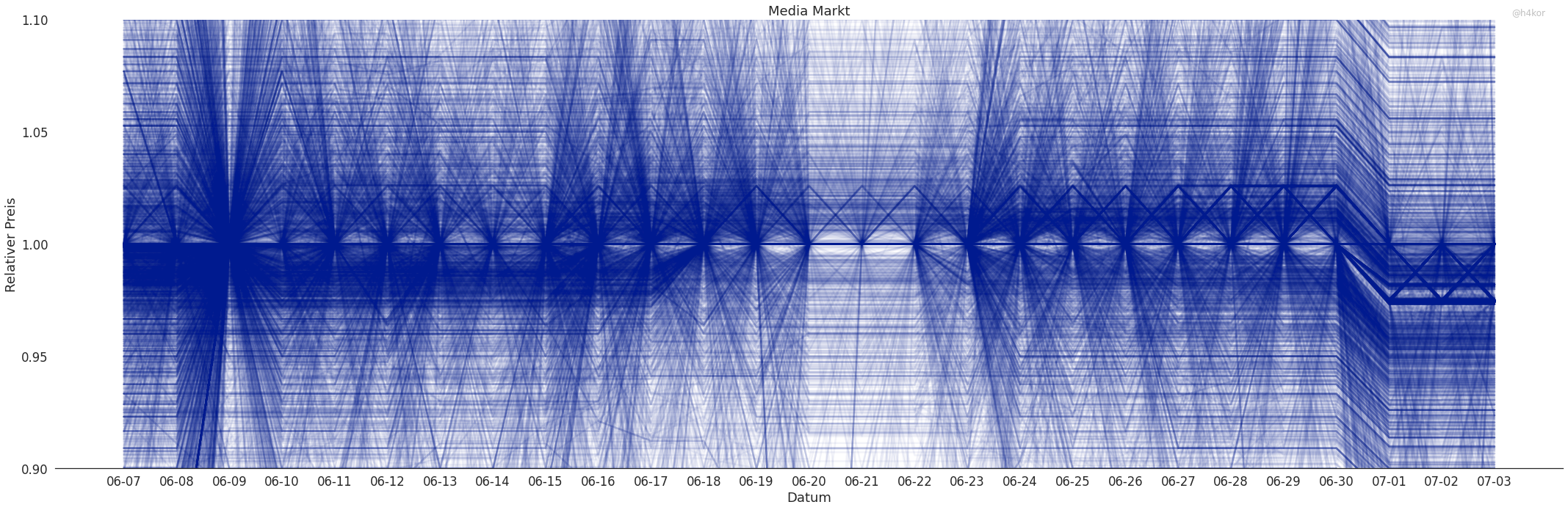
Hier lässt sich direkt die Preissenkung am 1.7 erkennen. Scheinbar wurden hier pauschal alle Preise gesenkt. Auf den ersten Blick lässt sich auch nicht erkennen, dass Preise vorher erhöht wurden.
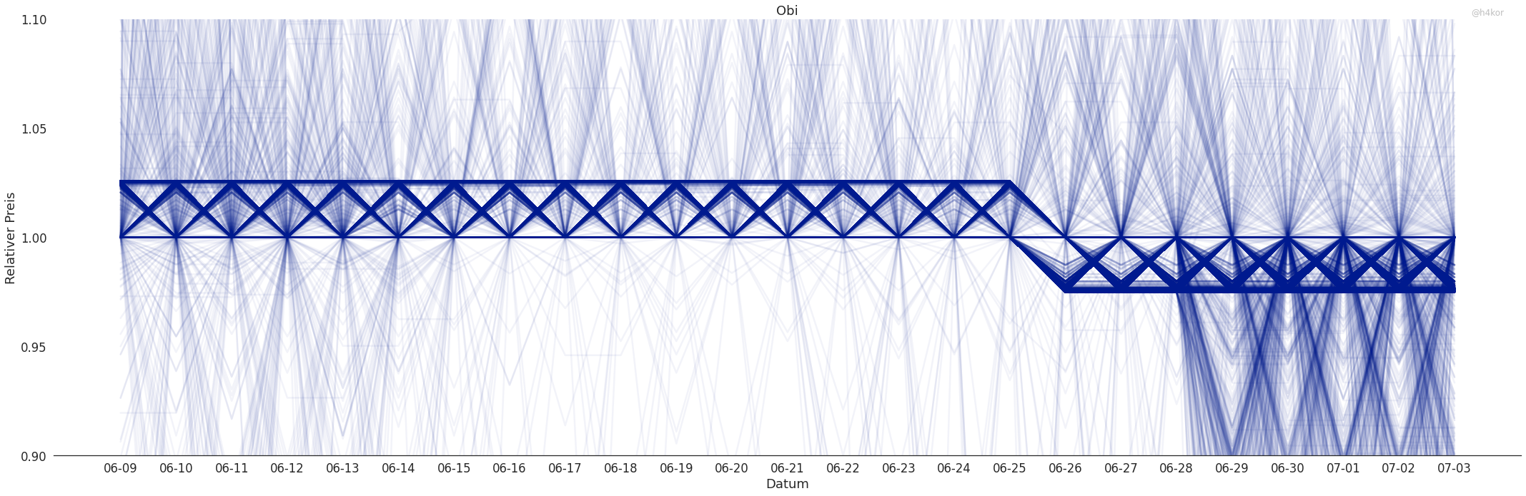
Bei OBI wurden die Preise schon am 25.6 gesenkt. Was es mit dem "Zick-Zack" Muster auf sich hat weiß ich noch nicht, es könnte aber ein Artefakt meiner Erhebung oder Visualisierung sein.
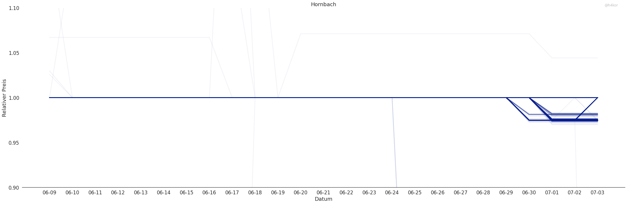
Bei Hornbach wurden viele Preise gesenkt aber bei weitem nicht alle.
Bei Avocado Store handelt es sich um einen Marktplatz (ähnlich zu Amazon). Viele Anbieter können hier ihre Waren anbieten.
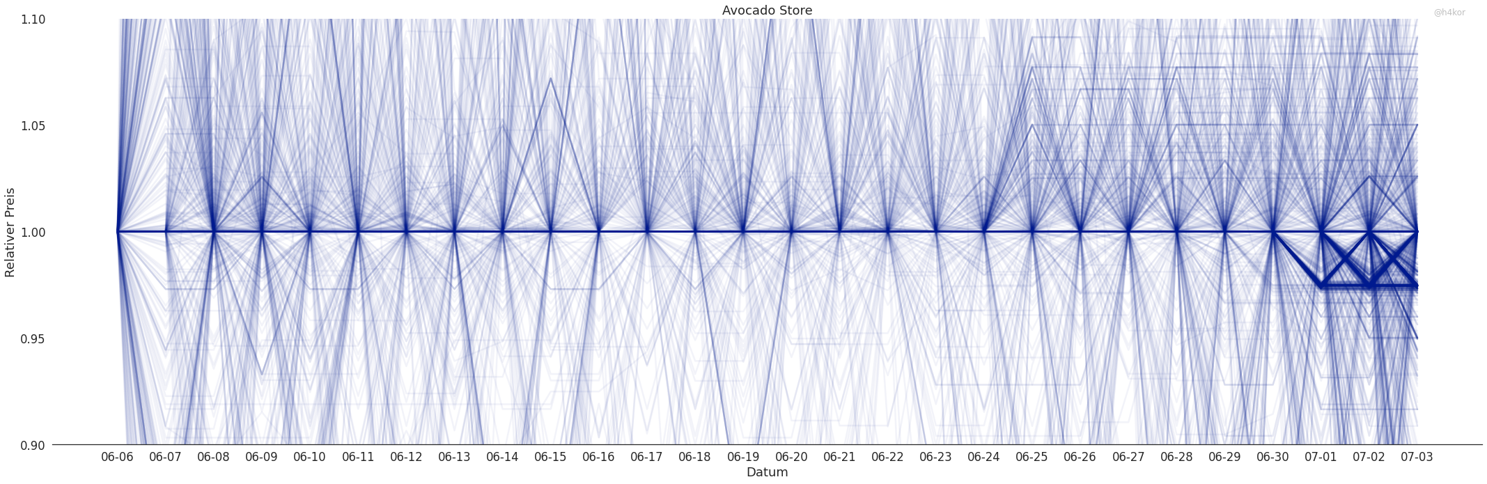
Einige Anbieter scheinen sich entschlossen zu haben die Preise zu senken. Auch hier zeigt sich ein leichtes "Zick-Zack" Muster (auch hier könnte es ein Artefakt meiner Erhebung oder Visualisierung sein). Hier wird interessant ob sich mit der Zeit mehr und mehr Anbieter entschließen die Senkung an den Kunden weiterzugeben. Ich weiß nicht wie viel Einfluss die Plattform selbst darauf hat.
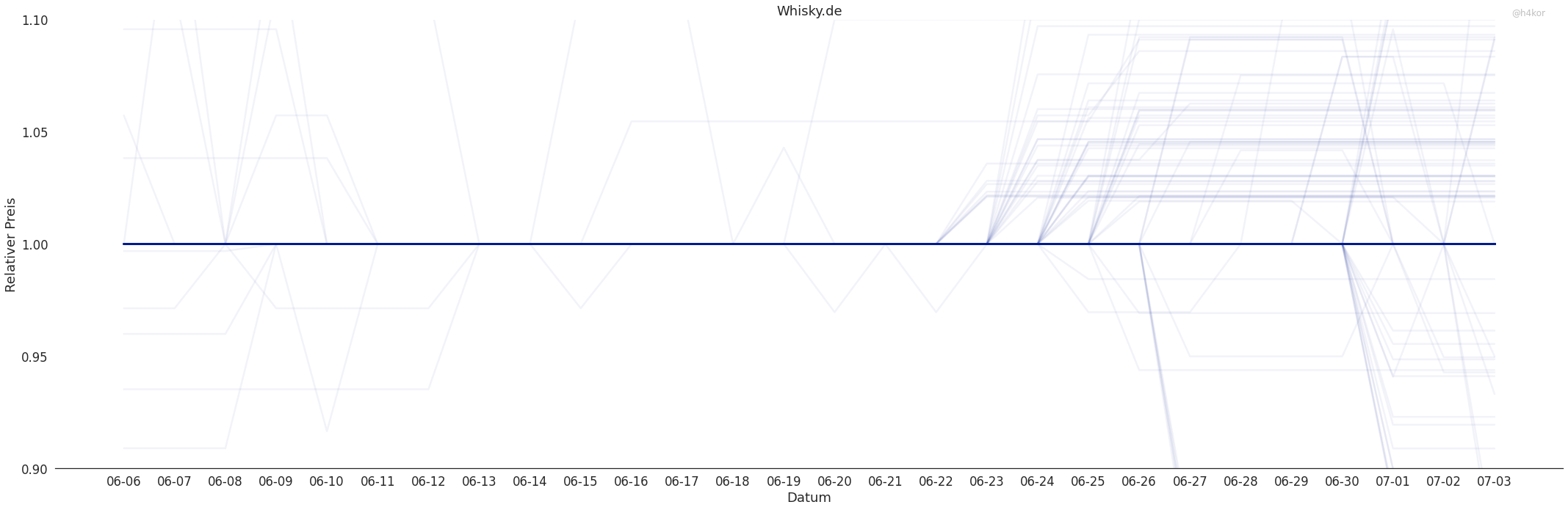
Whisky.de habe ich als Beispiel für ein spezialisiertes, kleines Unternehmen mit in die Analyse aufgenommen. Hier zeigt sich bis jetzt keine Senkung der Preise.
Insgesamt lässt sich sehen das die Mehrwertsteuersenkung an den Verbraucher weitergeben wird. An einigen Stellen sieht es noch so aus als wäre es nicht überall der Fall, aber dies sind bis jetzt nur Hypothesen die weiter untersucht werden sollten! Ich werde meine Scraper vorerst weiter laufen lassen und tiefer in die Daten eintauchen.
Inspired by: I thought console.log() needed some more flair and Benargee/rainbowLog.js
console.rainbow = (s) => {
    const [cs, c] = s
        .split("")
        .map((c,i) => ['%c'+c, `color:hsl(${20*i%360}, 100%, 50%)`])
        .reduce((p, c) => [p[0] + c[0], p[1].concat(c[1])], ["", []])
  console.log(cs, ...c)
}
console.rainbow("Hello World!")
Kessler Bomb
Siege Weapon
Deployed in low orbits around hostile planets.
On deployment millions of projectiles are scatters in random orbits around the planet, taking out all satellites after a few hours. The shrapnels will make launches from the attacked planet impossible for several decades.
Primarily used to lock down planets with offensive capabilities.
Prohibited by the New Geneva Convention, due to the high collateral damage
Estimating development time is similar to the coastline paradox. The more detailed your project description gets, the longer you estimation will be.
You start with "building a blog will take me 20 hours", then go to "OK actually I will need 10 hours for the data structure, 10 hours for a way to create posts and 10 hours for the actual website". For each of this estimations you will end up with more hours needed the further you break them down.
Breaking tasks down reveals more of the complexity of a task, leading to higher (hopefully more accurate) estimations.
![]()